
Rustic Origins
Branding Launch
Creative Director and Designer
Rustic Origins is a small business that offers a personal chef service specializing in hearty, down-to-earth meals reminiscent of Southern cooking. The business focuses on providing sizable portions and catering to busy families. They reached out to me in June 2024 for help launching their business with a logo and brand palette.
Approach and Process
For all my branding clients, I follow a few steps to get a deep understanding of their business and its goals with a brand. Before any design work began, the following had to happen:
Conduct a client survey to give the client an opportunity to go in-depth about their unique selling points, what they like in design, and what is at the core of their business.
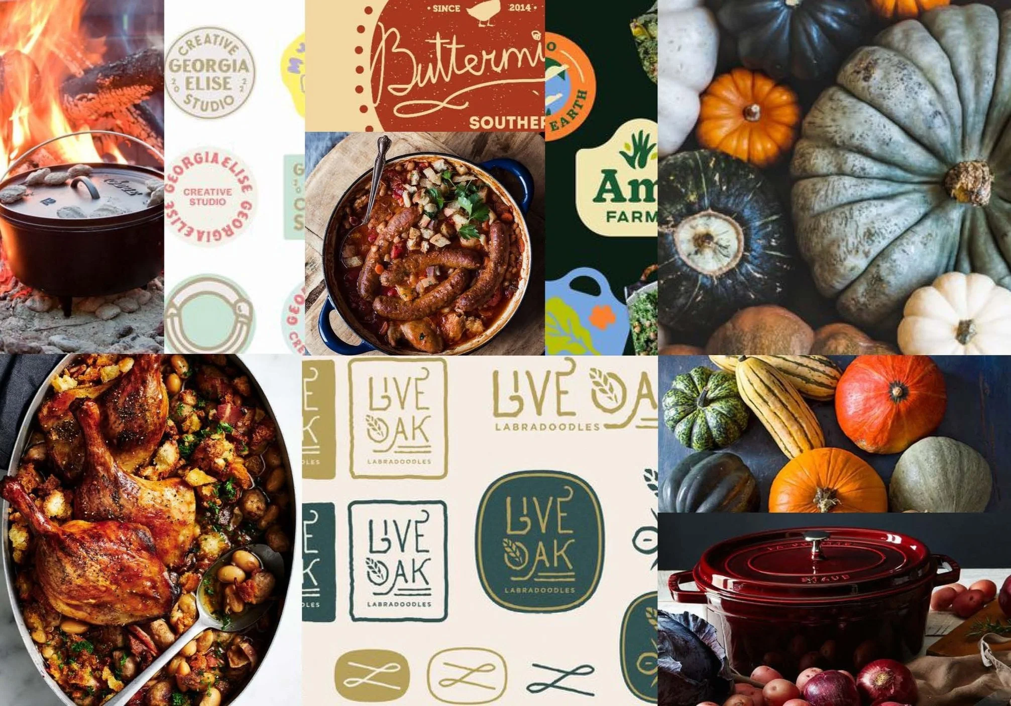
Independent research on other businesses in the market and related industries. I pulled examples of interesting brand solutions from competitors, from color to logo design and beyond.
A one-on-one client interview to go through the answers from the survey, ask questions, and expand my knowledge. This is also where we set expectations for the project.
Education on design trends was a key part of this project, as the client didn’t share many opinions on design in the survey. During our interview call, I walked them through trends in their industry to get a better gauge of what they liked. This is what led to the plan to use a stamp-style logo and go for a vintage theme, capitalizing on the Southern and rustic vibe.
Brand Personality
Home-cooked: Emphasizes accessible, hearty meals using what’s already in a client’s fridge.
Family Friendly: Prioritizes meals that appeal to families
Convenience: Provides a week's worth of meal prep in one visit, ensuring families have ready-to-eat, nutritious meals throughout the week.
Southern Roots: The chef is Southern and caters to the Metro Atlanta market with meals that she grew up with.
Creative Goals
Brand Identity: Develop a strong, rustic-inspired brand identity that evokes the warmth and heartiness of family-style meals.
Perfect for Digital: As a new business, most of Rustic Origins’ clients find the chef through social media.
Visual Aesthetics: Create a logo and brand visuals that reflect rustic elements, using colors inspired by food and harvest tones.
Organic shapes, not food: The client requested a design that felt softer and friendly, but didn’t feature a specific food.
Audience Consideration: Grow the new business’s reach by focussing on attracting families looking for convenient, nutritious, and customizable meal solutions.
MOODBOARD
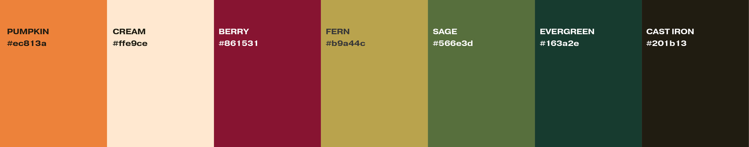
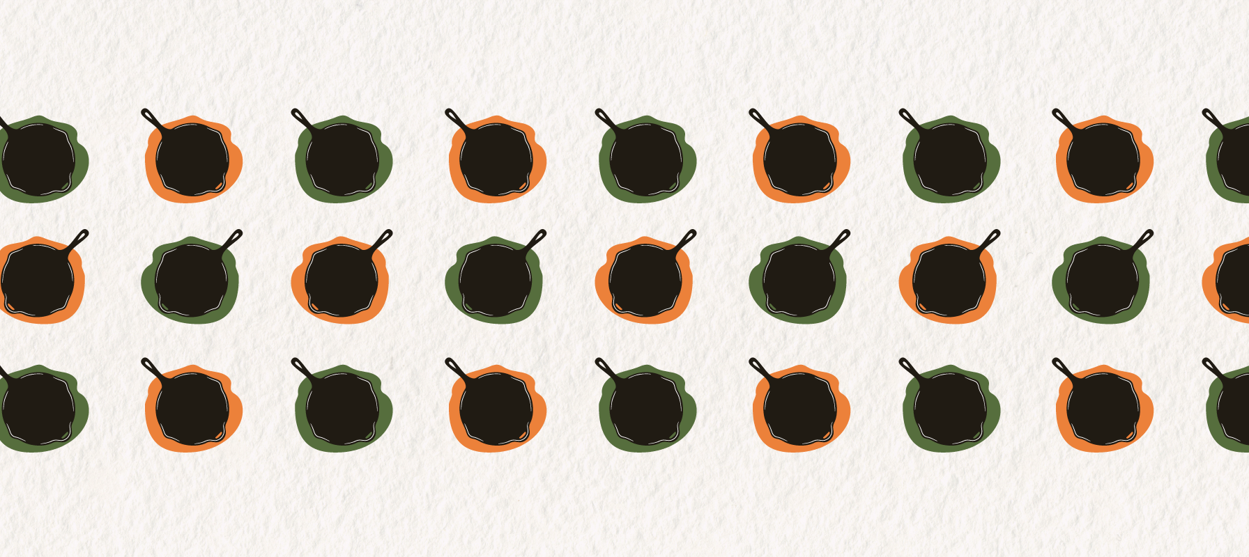
The Palette
This palette features warm fall hues and soft, faded tones to evoke a rustic, vintage charm. This palette is inspired by the timeless comfort of the harvest season and homemade meals. I’ve included an even mix of different tones to give the brand flexibility while still maintaining ADA compliance.
I landed on a core image:
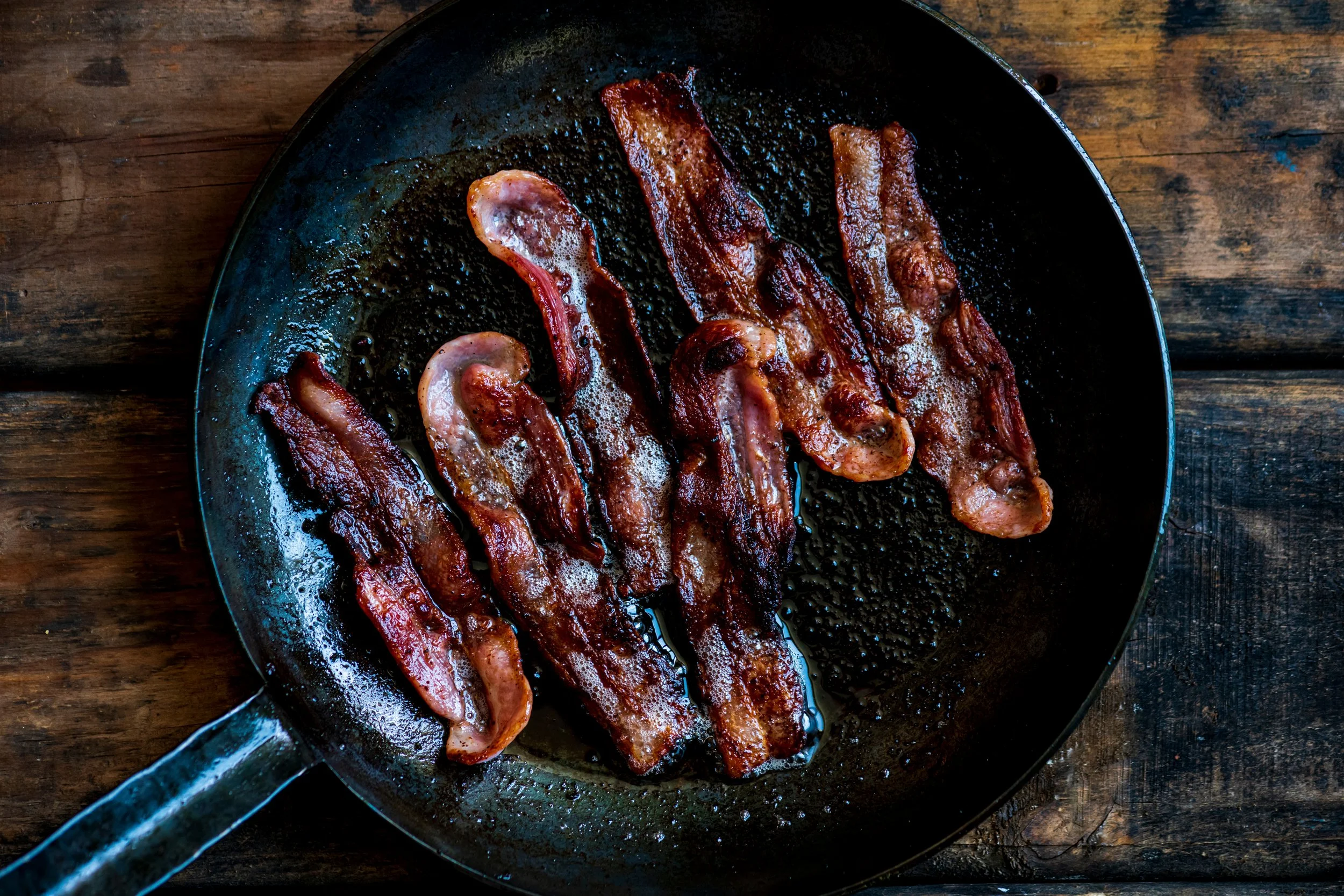
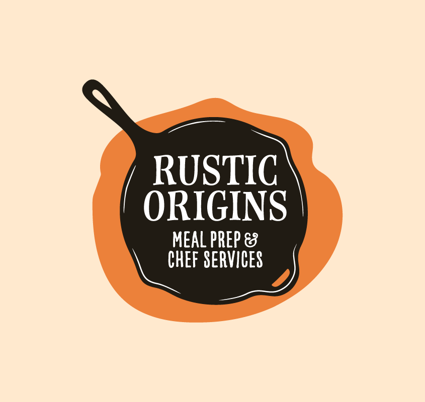
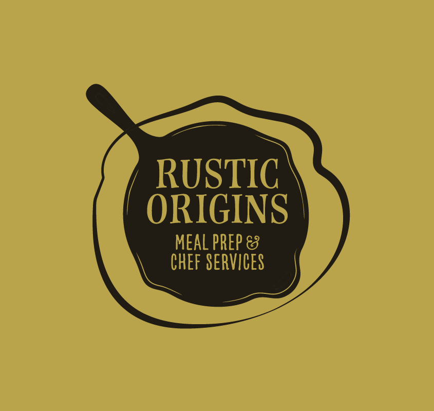
Cast Iron Cookware
Southern households have been relying on cast iron cookware for meals as far back as the 19th century. Lately, it has enjoyed a resurgence because of its ability to prepare iron-rich meals and its long lasting nature. This hardy tool is a staple in most Southern kitchens and perfectly encapsulates the nostalgic, home-cooked feeling Rustic Origins embodies.
THE LOGO
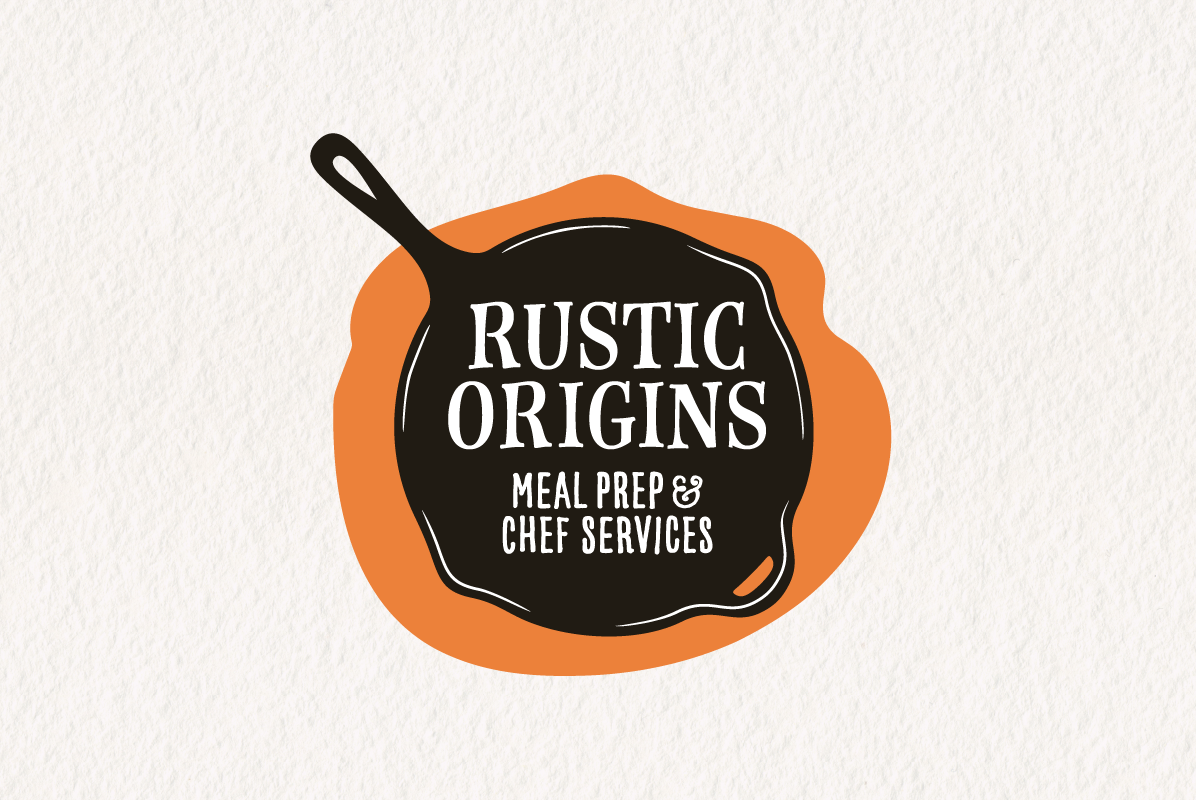
Inspired by the rustic kitchen staple, I incorporated a cast iron skillet to serve as the center of this stamp-style logo. The spill shape in the back balances out the design despite the skillet’s handle –– and makes the whole logo look a bit like a fried egg. This logo is not too slick and not overly clean — life is messy. Rustic Origins is here to help meet families where they are at.
I paired it with Farmhand Serif, a typeface that has a homespun feel to it but is still legible at small sizes.
Final Notes
Rustic Origins launched with a friendly, homespun logo that fits right in with their family-friendly goals. Tapping in Southern heritage and history was the perfect avenue for finding the image that was just right for this business. The client was extremely satisfied with the final design and we finished ahead of schedule.